# The Evolution of Tech Aesthetics: A Ctrl Alt Perspective on Google’s Icon Redesign
### Introduction: The Iconic Shift
In an era dominated by technology, where aesthetic appeal is as crucial as functionality, Google has made waves with its recent revamp of the Photos and Maps icons. This move is not merely about refreshing the brand’s visual language; it represents a strategic alignment with user preferences that prioritize both style and substance. As we explore this evolution, we must consider how these design changes underscore shifting sensibilities and set benchmarks for future developments in the tech landscape.
### New Icons, New Vibes
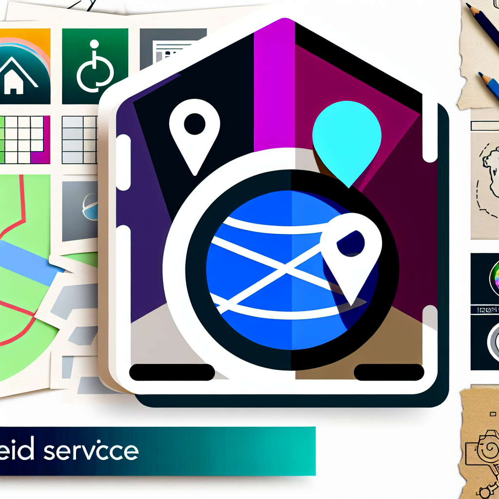
The latest icons for Google Photos and Maps embrace a striking gradient design that is both modern and vibrant. Google has moved away from minimalist flat designs, opting instead for colorful transitions that create a sense of depth and engagement.
But why gradients? The soft transitions of color resonate with a generation that not only craves creativity but also values personalization in their tech interactions. This design choice signals Google’s desire to captivate a demographic that finds beauty in dynamic aesthetics—those who are growing increasingly discerning about how technology reflects their identity.
### The Power of Visual Recognition
For daily tech users, recognition is paramount. Google’s gradient icons do more than please the eye; they are engineered for quick visual identification. In a digital sphere flooded with applications vying for attention, a bright, engaging icon stands out. Imagine trying to access your favorite photos and easily spotting the vibrant Google Photos icon, instantly triggering the associated memories embedded in that platform.
Icons, after all, function as gateways to a user’s digital experiences. Google’s conscious effort to infuse style into functionality emphasizes their awareness of this relationship. When we encounter visually appealing designs, we’re more inclined to interact with the technology—leading to a richer and more rewarding user experience.
### Reflecting Modern Sensibilities
The shift toward gradient designs speaks volumes about our contemporary preferences, shaped largely by the influence of social media platforms like Instagram and TikTok. These platforms have raised the bar for visual standards, compelling brands to innovate continuously. The gradient aesthetic not only resembles but also honors a generation that thrives on vibrancy, authenticity, and constant change.
Moreover, Google’s redesign reflects an evolved understanding of color psychology—emphasizing how colors influence mood and engagement. Designers are now more cognizant of how a thoughtful palette can transform our interactions, making them not just functional but emotionally engaging as well.
### What Lies Ahead: Trends Worth Watching
Google’s leadership regarding visual design sends out ripples that are likely to influence other tech companies. We can anticipate a marketplace increasingly driven by aesthetic considerations, paving the way for innovations in branding and user interfaces. As competitors respond to Google’s gradient approach, it could prompt a wave of similar redesigns across various digital platforms.
Furthermore, the future of design is likely to be impacted significantly by augmented reality (AR) and virtual reality (VR) technologies. As these immersive platforms become more mainstream, we might see a shift toward intuitive designs that offer tactile, sensory-based experiences, transcending current digital interactions.
### Practical Implications: Beyond Aesthetics
The implications of Google’s redesign extend beyond the visuals into practical user experiences. As technology continues to pervade every aspect of our lives, the demand for interfaces that prioritize both form and function will only grow. The evolution of aesthetic trends may lead to more inclusive designs, catering to diverse user needs while supporting the overarching theme of personalization.
Consider this: would embracing visually vibrant designs ultimately enhance our interactions with technology, making them more memorable and personalized? As users, it’s essential to reflect on how such aesthetic choices influence our connection with tech—from encouraging engagement to affecting our moods.
### Forward-Looking Conclusion: The Horizon of Tech Aesthetics
In conclusion, Google’s reimagined Photos and Maps icons encapsulate the intertwining relationship between form, function, and user experience in a fast-evolving digital age. This bold leap toward gradient-style design is not just a visual refresh; it’s a step toward crafting personalized experiences that resonate deeply with a younger user base.
As we navigate this new aesthetic landscape, one question arises: How will the evolving standards of design affect our engagement with technology in the future? Will we move towards a tech landscape where aesthetic and functionality merge seamlessly, or are we at risk of sacrificing usability for style? Your thoughts and experiences might help illuminate the path ahead.