# Ctrl Alt Perspective: Dissecting Google’s Design Revolution
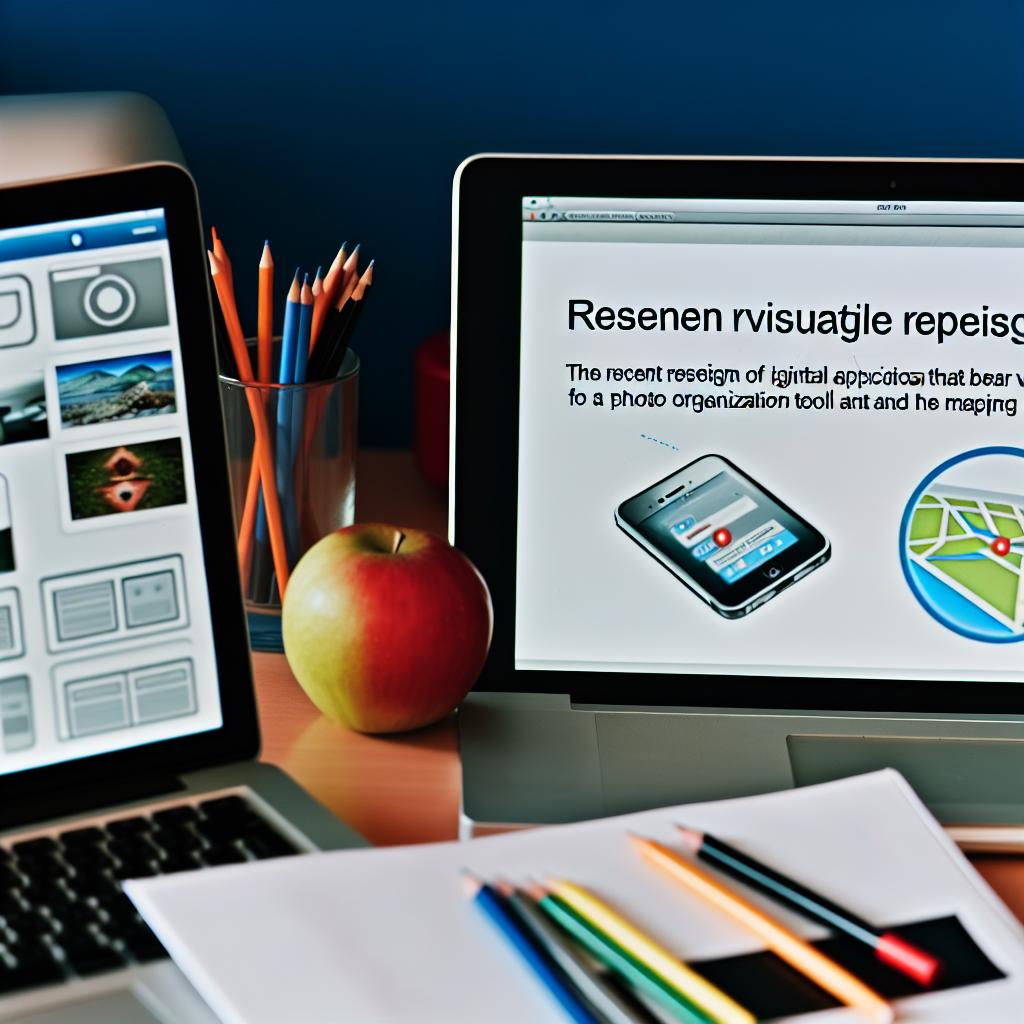
Innovation is the lifeblood of technology, and when a titan like Google announces changes, the world listens. Recently, Google unveiled a sweeping redesign of its Photos and Maps icons, introducing vibrant gradients and soft curves that not only enhance aesthetics but signify a pivotal shift in user experience. This redesign isn’t merely cosmetic; it’s a declaration of Google’s evolving philosophy, where the intersection of design and functionality drives user loyalty.
## Understanding the Shift in Iconography
Traditionally, Google’s icons served a functional purpose, providing quick access to a myriad of services. However, as we dive deeper into this redesign, it becomes clear that it symbolizes a significant evolution in user interaction. Today’s digital users—particularly the savvy millennials and Gen-Z cohorts—demand more than just efficiency; they want enjoyment and emotional connection in every click.
The new Google Photos and Maps icons leverage soft curves and gradients, yielding a warm, inviting feel that resonates with a generation accustomed to a visually rich digital landscape. It’s important to understand that this isn’t just about making things pretty. Icons must communicate a message. For instance, vibrant colors improve visibility, which is essential in an age where distractions abound. The question arises: How can a balance between delight and practicality be achieved without compromising either?
## Simplifying User Interfaces: Less is More
In a tech world flooded with information, simplicity stands as a champion. The new Google icon set incorporates minimalist design principles—streamlined shapes paired with playful gradients that draw the user in instead of overwhelming them.
Simplicity, however, is nuanced. The challenge lies in decluttering without losing identity. Google’s redesign embraces this philosophy, providing clear, recognizable icons that transcend cultural and generational boundaries. This brings us to the design concept of **intuitive navigation**, where users can easily locate what they need with minimal effort. With high-contrast colors and engaging gradients, Google is setting a precedent for digital clarity, mitigating eye strain during prolonged use. As industry observers, it prompts us to ask: Can minimalism really fulfill today’s dynamic demands, or will complexity inevitably creep back into design?
## Catering to the Trend-Savvy User
The design landscape is witnessing a metamorphosis—moving towards bold graphics and dynamic visual elements that can excite and engage users. Google’s redesign isn’t just in the spirit of innovation; it closely aligns with the cultural preferences of its primary user base.
For millennials and Gen-Z, representing innovation becomes pivotal. They seek brands that echo their values of creativity, accessibility, and relevance. Google is attempting to not merely participate in the design conversation but lead it. As digital natives heavily influence consumer behavior, it raises the inquiry of whether staying relevant in design requires more than just aesthetic considerations but a true understanding of user needs and current trends.
## Merging Form with Function
What stands out in this redesign is not just visual appeal but also functional enhancement. A redesigned icon can improve usability by incorporating familiar shapes and color schemes. Each app’s function is vividly represented through thoughtful design—encapsulating a balance of form and function.
The inclusion of user feedback in beta testing showcases a commitment to adaptability—a characteristic crucial in establishing a meaningful rapport with tech-savvy audiences. It’s a gradual recognition that user experience has evolved from functionality-centric paradigms towards designs that prioritize comfort and accessibility. This movement is indicative of a larger industry trend that emphasizes user engagement through delightful interactions.
## Conclusion: Design as a Cultural Shift
The refreshed icons of Google_Photos and Maps illustrate a noteworthy shift in app design philosophy, emphasizing user engagement through visual richness rather than viewing it as a mere perk. This signifies a deeper understanding that a digitally rich experience is a necessity for retaining user loyalty and connection.
As Google propels itself into the future of design, other tech companies are likely to follow suit—driven by consumer demands for more humanized, welcoming experiences. The upcoming years will reveal whether this trend becomes an industry standard or fades into the landscape of fleeting design fads.
Looking forward, we must ponder: How will this visual revolution in app design reshape our interactions with technology in the long term, and what can it teach us about the intersection of aesthetics and usability?
—